AKA How to Finally Pick a Color Without Repainting It Three Times
You know that moment when you’re driving through a neighborhood and one house just stops you? Nine times out of ten, it’s the front door. A beautiful door on a white house is one of the easiest, highest-impact curb appeal upgrades you can make — and yet so many people overthink it into total paralysis.
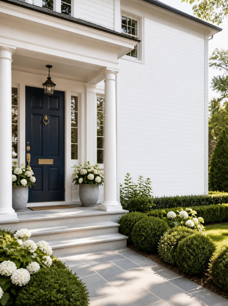
I’ll be honest: I repainted my own front door three times in two years before I finally landed on something I actually loved. What I learned from all of that trial and error is that white houses are genuinely a gift. They’re a blank slate. Almost every color pops against them, as long as you pair it right.
To make things easier, I’ve grouped the best front door colors for a white house by mood and style, so instead of scrolling through 20 disconnected options, you can skip straight to your section. Each color still gets my full honest take — just organized in a way that actually helps you decide.
- 1. The Classics: Black, Navy & Deep Red
- 2. The Greens: Hunter, Sage, Forest & Olive
- 3. The Blues: Cobalt, Royal Blue & Teal
- 4. Warm & Earthy: Terracotta, Burgundy & Yellow
- 5. The Unexpected Ones: Blush, Lavender, White & Charcoal
- By the Numbers: Which Colors Are People Actually Choosing?
- How to Choose the Right Front Door Color for Your White House
- Frequently Asked Questions About Front Door Colors for White Houses
- Final Thoughts
- You may also like:
1. The Classics: Black, Navy & Deep Red
These are the front door colors that have been working for decades — not because they’re boring and safe, but because they genuinely look great on almost every white house, every style, every year. If you want something you’ll still love in ten years, start here.

Black
If I had to send someone to the paint store with zero other information, I’d say black. A matte black door against a white exterior is one of those combinations that’s genuinely hard to get wrong — sharp, elegant, and completely timeless without ever feeling overdone.
The one thing people worry about is it feeling harsh or cold. It doesn’t, as long as you soften it with some greenery, a wreath, or a natural fiber doormat. Pair with brass or matte black hardware and it’s done. Honestly, done.
Navy Blue
Navy is the blazer of white house front door colors — goes with everything, never overdressed, makes your whole house look like it has its act together. There’s a warmth to a good navy that black doesn’t quite have, which makes it feel slightly more welcoming without sacrificing any of the sophistication.
Brass hardware is the move here. The combination of deep navy and warm brass against a white exterior is one of those things that photographs beautifully and looks even better in person.
Deep Red / Cherry Red
A red door on a white house sounds almost too obvious — until you see it done right and remember why it’s never actually gone out of style. Deep red brings warmth and a sense of welcome that few other colors can match. It’s traditional without being boring.
The key word is deep. Bright, candy red veers into firetruck territory fast. Go for something rich and saturated — Benjamin Moore’s Caliente or Sherwin-Williams Heartthrob are both excellent — and you end up with something that reads as classic, not costume-y.
2. The Greens: Hunter, Sage, Forest & Olive
Green has been having a serious moment for a couple of years now, and it shows no signs of slowing down. The reason it works so well on white houses is that it creates an earthy, grounded contrast without feeling jarring. It feels like it belongs there — which is exactly what you want from a front door color.
The range within green is wide though, so let me break it down.
Hunter Green
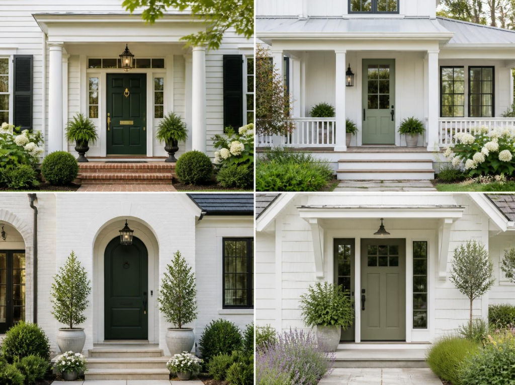
Hunter green is the one you’ve been seeing everywhere on Pinterest, and for good reason. It’s rich, structured, and manages to feel both traditional and fresh at the same time — which is a rare and useful combination.
With mature trees or lush landscaping, it blends beautifully into the surroundings. Against a very clean, minimal white house, it becomes a genuine statement. The great thing about hunter green is that it works either way.
Sage Green
Sage is softer and more muted than hunter, which gives it a completely different energy — more cottagecore, more relaxed, less formal. If hunter green is a dinner party, sage is Sunday brunch.
It works especially well when your white siding has a warm undertone — think off-white or cream rather than stark bright white. The two tones play together organically and feel genuinely beautiful rather than contrived.
Forest Green
Forest green is hunter’s moodier, slightly darker cousin. It goes deeper, which gives white houses a more dramatic presence — without crossing into anything heavy or unwelcoming. It photographs especially well in fall and winter, when it feels festive and cozy.
If you have a lot of natural stone, cedar, or dark wood elements on your exterior, forest green ties everything together in a way that feels intentional and cohesive.
Olive Green
Olive sits in that sweet spot between sage and forest — earthy and complex, and it shifts in different lighting. Sometimes it looks almost gold. Sometimes it looks more khaki-green. Somehow it always looks interesting.
This is the pick for people who want green but don’t want to be predictable about it. It reads as a considered choice rather than a trend pick, which means it tends to age well.
3. The Blues: Cobalt, Royal Blue & Teal
Beyond navy, there’s a whole family of blues that look incredible on white houses — and they’re more approachable than they look in paint chips. These are for people who want real impact. The key with bolder blues is to keep everything else simple so the door gets the full spotlight.

Cobalt Blue
Cobalt is the bravest pick on this list — vibrant, unexpected, and when it works, it really works. The key is committing fully and keeping the surrounding elements clean. Cobalt with brushed nickel or chrome hardware, a simple surround, and minimal landscaping looks intentional and stunning. Add too many competing elements and it tips into chaos fast.
This is the door color that makes people slow down when they drive past. If that’s what you want — go for it.
Royal Blue
Royal blue is brighter than navy but not as intense as cobalt, which puts it in a sweet spot for people who want real impact without total commitment to bold. It’s cheerful and confident — it gives your white exterior immediate personality without requiring much else to support it.
Think classic New England coastal town energy. A royal blue door with crisp white trim and simple landscaping is as classic as it gets, and it photographs beautifully if resale is on your radar at all.
Teal
Teal has a wide range — from almost-blue to almost-green — which means you can find a version that works with virtually any white exterior. The key is going for something deeper and more muted rather than bright and retro. Think vintage Charleston charm, not 1950s diner.
It reads as confident and distinctive without being bizarre, which is actually a hard balance to find. A great option for craftsman or Victorian homes where you want color that feels historically appropriate but still fresh.
4. Warm & Earthy: Terracotta, Burgundy & Yellow
These colors bring heat and richness to a white exterior in completely different ways. They tend to work best with warm-toned siding (cream, off-white) rather than cold, stark white — so check your siding’s undertone before going this route. When it works, it’s really warm and inviting.
Terracotta
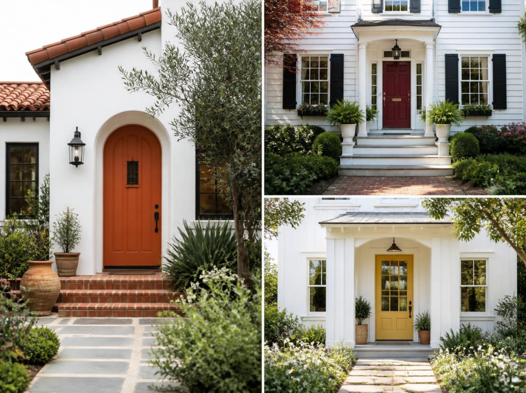
Terracotta has taken over interiors for the past couple of years, and it translates surprisingly well to a front door. Against a white exterior it’s warm, earthy, and grounding in a way that feels unexpected but completely right — especially with natural stone, clay pots, or warm-toned gravel in the landscaping.
Think Mediterranean farmhouse meets desert chic. It’s a mood — a very good one. Worth noting: this is the most “trending” color on this list, so factor that in if you’re thinking about resale in the near future.
Burgundy
Burgundy is deep red’s more refined, wine-educated older sibling. It feels genuinely luxurious in a way that plain red sometimes doesn’t quite reach — richer, more layered, more intentional. It’s a slightly unexpected choice that still reads completely classic.
It’s especially stunning on Victorian or colonial homes, and even more so if you have any brick elements on the exterior. The burgundy-brick-white combination is one of those things that just works on every level.
Yellow
A yellow front door on a white house is pure, unapologetic joy. It signals immediately that whoever lives there is not afraid to have fun with their space — and from the street, it just makes people smile.
The critical thing is picking the right yellow — buttery and golden, not neon or primary. Sherwin-Williams Sunflower and Benjamin Moore Hawthorne Yellow are both sophisticated enough to pull off long-term without feeling like a novelty you’ll regret in two years.
5. The Unexpected Ones: Blush, Lavender, White & Charcoal
These are the colors people overlook — either because they seem too subtle, too out-there, or too “safe.” All four of them can look genuinely stunning on a white house when done with intention. These are my personal favorites to talk people into.
Blush Pink
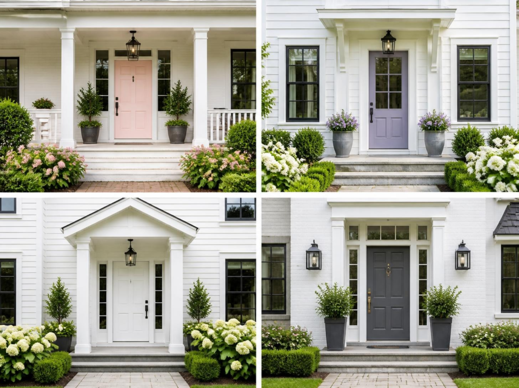
Before you scroll — hear me out. Blush on a white house is not “girly.” Done right, it reads as almost-neutral from the street: soft, subtle, and genuinely beautiful up close. The key is going light enough that it doesn’t read as pink-pink. Think dusty rose, not Barbie’s dream house.
Paired with brass or matte gold hardware, it’s unexpectedly chic in a way that most people don’t see coming. This is the quiet confidence of front door color ideas for white houses.
Lavender
Lavender might be the most underrated option on this entire list. It’s unexpected, romantic, and photographs beautifully — especially in morning or late afternoon light. Like blush, the success is entirely in the shade. Dusty and muted, not bright or purple.
Dusty lavender with aged brass hardware and a dried flower wreath is genuinely one of the most beautiful front door combinations I’ve ever seen. I am not taking criticism on this one.
Bright White
Don’t underestimate a white front door on a white house. Done intentionally, it’s clean, fresh, and modern without being boring — it’s a classic that’s underused precisely because people assume it won’t stand out.
The trick is using a slightly different white for the door than the siding (warm vs. cool tone, or glossy vs. flat finish), and letting the door’s texture — paneling, glass inserts, hardware — do the visual work. A crisp white door with matte black hardware and clean lines is a genuinely sleek look.
Charcoal Gray
Charcoal is what happens when you want the drama of black with slightly softer edges. It’s understated in the very best way — modern and clean, but warmer than black, which makes it work especially well if your house has any warm-toned elements (natural wood, warm stone).
If your white house already has gray accents — roof, shutters, stone — charcoal ties everything together in a way that feels considered and cohesive rather than accidental. Great for people who think in systems.
By the Numbers: Which Colors Are People Actually Choosing?
If you’re still torn, it helps to see where most people land — and which colors have the biggest impact on home value.
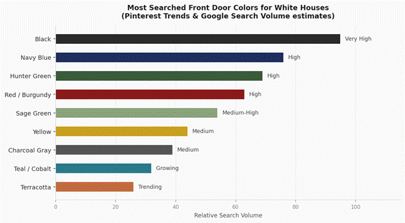
Chart 1 — Relative popularity based on Pinterest Trends & Google search volume estimates
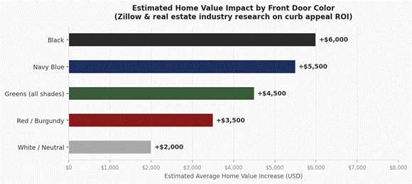
Chart 2 — Estimated home value impact. Zillow & real estate industry research. Actual impact varies by market and style.
How to Choose the Right Front Door Color for Your White House
Before you head to the paint store, here’s the quick version of everything I’ve learned:
- Let the architecture lead. A Victorian wants something rich and layered. A modern farmhouse wants something muted and earthy. A craftsman can handle almost anything. Start there.
- Check your fixed elements first. Roof color, shutters, brick or stone — your door should work with those, not fight them. Warm undertones in your siding pair better with warm-toned doors (red, yellow, terracotta).
- Test before you commit. Paint a big swatch directly on the door and look at it at multiple times of day. Colors shift dramatically between morning sun and late afternoon shade.
- Match your hardware to the mood. Black hardware goes with almost everything. Brass elevates warm tones and richer colors. Brushed nickel reads as cooler and more modern.
- Think about finish. High-gloss looks gorgeous and cleans easily, but shows every imperfection. Satin or semi-gloss is more forgiving and just as beautiful.
- Factor in resale if it’s relevant. Classic choices (black, navy, deep red) have the broadest appeal and photograph best for listings.
Frequently Asked Questions About Front Door Colors for White Houses
What is the most popular front door color for a white house?
Black, consistently. It’s the most searched, most recommended, and genuinely works on almost every architectural style. Navy blue and hunter green are close behind, and both have been surging in popularity over the past couple of years.
Does a black door look good on a white house?
Almost always, yes — especially matte black. It’s one of those combinations that’s genuinely hard to get wrong. Pay attention to the hardware and surrounding trim, and soften it with a little greenery if it feels too stark.
What color front door adds the most value to a home?
Black and navy come up most consistently in real estate data as colors that support higher sale prices. The effect isn’t enormous, but a well-chosen front door in good condition absolutely helps — it’s a low-cost, high-visibility upgrade with solid ROI.
Should a front door be lighter or darker than the house?
There’s no hard rule, but contrast tends to look more intentional and polished. A white house with a very light door can feel flat from the street. A darker or more saturated color gives the entry a clear focal point, which is generally what you want.
Can I use a bold color if the rest of my exterior is simple?
Yes — and a simple white house is actually the ideal canvas for a bold door. No competing elements means the door gets the full spotlight. This is exactly the situation where going bold pays off most.
Final Thoughts
Choosing front door colors for a white house is genuinely one of the most fun home projects you can take on, because the visual impact is huge and the commitment is just a can of paint. Find your group, pick the color that makes your stomach do a little flip, and go with it.
The safe choice is almost always the one you’ll quietly regret. Go make your neighbors slow down.
If you’re looking for more creative ideas and inspiration, be sure to check out my Pinterest page!
With love – Zsana
You may also like:
- Patio Decor Ideas on a Budget That Actually Look Expensive
- Why a Covered Outdoor Kitchen Might Be the Best Thing You Add to Your Backyard
- How I Give My Home a Summer Feeling Without Buying Everything New
